CARTOGRAPHY COMPARISON: GOOGLE & APPLE
Introduction · Part 1 · 📍PART 2
PART 2: THE MAP AS A WHOLE
Labeling & Detail
⚠️ Tap or click any image to enlarge
There’s a saying amongst cartographers that “labels are half the map”. And if you were to remove all of the labels from Google Maps and Apple Maps, it would certainly seem true.
Here’s Google Maps with and without labels:
And here’s Apple Maps:
Putting the two label-less maps side-by-side, they actually look quite similar:
It’s almost as if the same things are drawn on both maps (e.g., the same roads, the same parks, etc.)—they’re just colored differently.
Google Maps offers a map styling API—so let’s use it to make Google’s map look more like Apple’s, to better compare them. First, let’s adjust the coloring of Google’s roads to more closely match Apple’s:
Now let’s adjust the color of Google’s land and water and its park, hospital, and university areas:
Remarkable. We’ve changed just a handful of Google’s colors—and the maps look almost identical. There are some subtle differences (which we’ll look at later)—but in terms of the shapes and lines drawn on each map, the two maps are quite similar.
But what about the other “half” of the map? The labels half? Is what’s labeled as similar as what’s drawn?
Let’s look again at the maps we started with:
Comparing the two, there’s a large number of labels that appear on one map — but not on the other. Here they are, outlined in black:
The two maps have very few labels in common—so few, in fact, that if we only kept the labels that they do have in common, the maps wouldn’t label much:
So perhaps more than anything else, the biggest difference between Google Maps and Apple Maps is in what each chooses to label...
* * *
LABELS
🔎 INVESTIGATION #8
How Often do the Maps Label the Same Things?
How often are Google and Apple Maps labeling the same things (e.g., the exact same cities, roads, countries, etc.)?
For example, take these New York maps at z9:
Google labels 25 things, while Apple labels 42—and together, they label a combined total of 67 unique things.
But out of everything labeled above, there are only 4 things that both Google and Apple label: the cities of New York, Newark, Hempstead, and Edison. In other words, the maps have just 5% of their labels in common.
Is it the same for all zooms?
* * *
First, let’s count the number of labels that both maps have in common at each zoom:
Next, taking the total number of unique labels on each map pair, let’s calculate the percentage of labels that the maps have in common at each zoom and plot them on a graph:
In terms of what they label, Google Maps and Apple Maps are the most similar early on. But as you zoom in, they diverge, and after z6, they never have more than a third of their labels in common.
In and of itself, the two maps, on average, never have more than 57% of their labels in common at any one zoom.
The graph above shows that z2 is the zoom where the maps are the most different, having just 4% of their labels in common. Let’s look at z2 on our New York map pairs:
Glancing at z2, it’s not hard to see why the maps have so few labels in common: they’re labeling different things. Google is labeling countries, while Apple is labeling continents and cities. In fact, the only thing the maps have in common are their ocean labels.
That said, it’s puzzling that both maps have so few labels. Combining the maps together, we see that Google could fit some of Apple’s cities (such as New York and Los Angeles); and that Apple could fit some of Google’s country labels (such as the United States and Mexico):
Why not label continents, countries, and cities together?
In any event, the zoom where the maps have the most labels in common (z4) is only two zooms down from our most different zoom (z2):
Here’s z4 on our New York map pairs:
Here are the labels that the two maps have in common (highlighted in green):
As expected, there’s a lot of green on both maps.
But let’s instead focus on the differences:
There’s a pattern here… do you see it?
I’ve highlighted it below:
On Google Maps, the labels that are different from Apple are all state and province labels (except for Ottawa). And on Apple Maps, the labels that are different from Google are all city labels.
If we combine the two maps together, we see why they’re different:
Notice that Google’s labels for West Virginia and Maryland overlap with Apple’s label for the city of Washington. Google labels West Virginia and Maryland, but in doing so, leaves too small of a space to also label Washington on its map.
Apple, meanwhile, labels Washington—but Washington’s label occupies the space where West Virginia and Maryland would be labeled, so they don’t appear on Apple’s map.
And there are at least three similar situations on the map above:
Google labels Connecticut, while Apple labels New York City.
Google labels Arkansas, while Apple labels Memphis.
Google labels Louisiana, while Apple labels New Orleans.
In each situation, Google is prioritizing states / provinces, while Apple is prioritizing cities. And a quick glance at the zoom right before (z3) confirms our suspicion:
Notice that Google labels states and provinces, but no cities. And Apple labels cities, but no states or provinces.
It’s fascinating, isn’t it?
Even on the zoom where the maps are the most similar (in terms of what they label), we see competing design approaches.
Above, Google is aiming for completeness. It manages to label each and every U.S. state and Canadian province in view. But it does so at the expense of not labeling the U.S.’s largest city and its capital city—New York and Washington, respectively.
And New York’s and Washington’s absence is even more conspicuous when you consider that Google labels Toronto and Ottawa (Canada’s largest city and capital city, respectively) — without also labeling New York and Washington.
Apple, meanwhile, labels New York and Washington—but at the expense of not labeling several U.S. states. And just as it looks peculiar for Google to label Toronto and Ottawa, but not New York and Washington—it looks equally strange to see an incomplete listing of U.S. states on Apple’s map.
What’s more important on a zoom like this? States or major cities? And are more people looking for Connecticut or New York City? West Virginia or Washington, DC?
And how important is it to label all of the U.S. states at once?
It’s a classic cartography problem: you don’t have enough space to label everything, so what do you label? What are the top things here?
Each map has voted with its pixels, and it’s interesting to see:
Google thinks states are more important—so Google labels all of the states, and if there’s space left over, it then labels cities. (Hence, Ottawa.)
Apple thinks major cities are more important—so Apple labels the biggest cities, and then if there’s space left over, it labels states.
Neither is wrong—but each decision comes with its own tradeoffs.
But it’s also interesting that z4 is the most similar zoom, given that it’s one of the very earliest zoom-levels and shows a relatively larger chunk of the world than any of the maps after it:
Notice how wide of an area our z4 maps show—almost the entire Eastern half of the U.S. and the most populated parts of Canada:
Within the area above, there are millions of things that could be labeled: dozens of states and provinces, thousands of cities, tens of thousands of roads, and tens of millions of points of interest—among many other things.
In other words, because z4 shows such a wide area, there’s a greater number of label candidates at z4 (i.e., things that could be labeled) than at any zoom after it.
Isn’t it interesting, then, that the maps are most similar where they have the greatest choice in what to label (z3, z4, z5, z6)?
* * *
We’ve looked at both extremes—the most similar zoom and the most different zoom—but what’s the average? How often, on average, do Google Maps and Apple Maps label the exact same things?
Let’s take our table from earlier and average the percentages:
On average, Google Maps and Apple Maps label the same things only 24% of the time.
These truly are very different maps.
* * *
We saw earlier that these two z9 maps had four cities in common—but little else:
Are there certain kinds of labels (such as cities) that the maps are more likely to have in common?
Let’s divide everything labeled on the maps into a handful of categories. We’ll use these:
Land & Water: Large areas of land (continents), small areas of land (islands), and any kind of water-related feature (oceans, lakes, rivers, bays, etc.). E.g., North America, Atlantic Ocean, San Francisco Bay, East River, Long Island.
Countries: Sovereign states and their dependencies. E.g., France, Spain, Canada, United States, United Kingdom.
Country Sub-Areas: Formal areas within countries, such as U.S. states, Canadian provinces, and U.K. constituent countries. E.g., California, Québec, Wales.
Cities. E.g., New York, San Francisco, London, Newark, Oakland, Reading.
City Sub-Areas: Formal and informal areas within cities, such as neighborhoods, districts, and boroughs. E.g., Brooklyn, Chinatown, Westminster, Chelsea, Fisherman’s Wharf, Midtown Manhattan.
Roads. E.g., M1, Interstate 80, California State Highway 1.
Places. E.g., the Empire State Building, Patricia’s Green, Nelson’s Column.
Now let’s take our map pairs…
…and count the labels that each pair has in common:
Above, our z6 San Francisco map pair has 8 labels in common: 1 country sub-area (California) and 7 cities (Redding, Reno, Sacramento, San Francisco, San Jose, Fresno, and Bakersfield).
Let’s count the labels in common on our 53 other map pairs, tallying the totals for each zoom:
Next, let’s divide these totals by the total number of labels per category on each zoom, and see what kind of percentages we get:
Notice that more than half of the percentages are less than 25% (the pink figures). Let’s calculate each category’s average (across all the zooms) and order the results from highest to lowest:
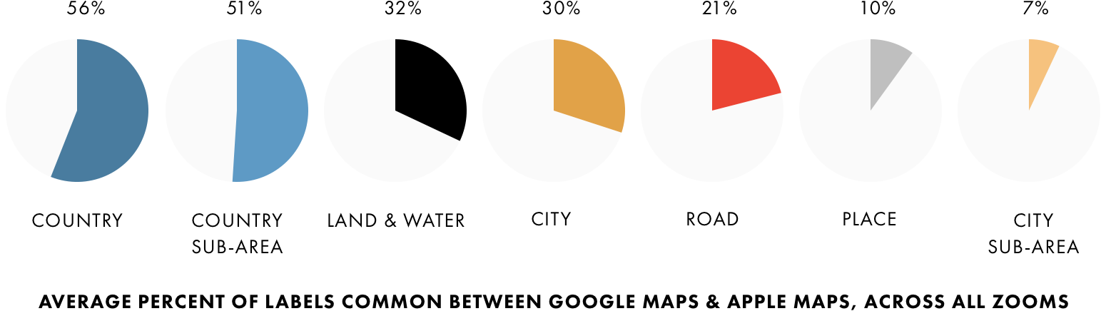
Out of all of the different kinds of labels on both maps, Google Maps and Apple Maps are most likely to label the same countries and least likely to label the same areas within cities (i.e., districts, boroughs, neighborhoods).
Google and Apple also have only 30% of their city labels in common and just 21% of their road labels. This means that the majority of the time, the maps are labeling different cities and roads from one another.
And at just 7%, the city sub-area percentage is especially low. Here’s a good example of one of those 13 pairs — New York at z13:
Each map labels distinct seven areas within New York City—but they’re completely different between the two maps.
And even the map pair with the most city sub-areas in common—London z12—shares only a fraction of its labels:
Together, the maps above label 28 unique areas within London — but have just 9 in common.
Ironically, the pair with the second highest number of city sub-areas in common is San Francisco at z13 (the zoom we saw earlier where the maps had very few labels in common):
Apart from a few road labels, the area labels are the only labels that the maps have in common—and it’s not many, at that:
Together, the maps label 25 unique areas within San Francisco — but surprisingly have just 6 in common.
San Francisco has many well-known areas and neighborhoods (Fisherman’s Wharf, Haight-Ashbury, North Beach, Union Square, etc.)—but perhaps the most famous of all is Chinatown.
📷 Chinatown, San Francisco
Yet even though Google and Apple label 25 distinct areas at this zoom, neither map labels Chinatown:
Surprising, isn’t it?
(Living in San Francisco, I’m asked for directions to Chinatown more often than any other area or place in the city. I was also surprised to learn that Chinatown draws more visitors annually than the Golden Gate Bridge.)
* * *
We saw above that Google Maps and Apple Maps have just 24% of their labels in common. (Fewer than 1 out of 4 labels!)
Why is the difference so large? And what could explain this?
Perhaps one map has significantly more labels? (If one map has more labels, the two maps wouldn’t have as many in common.)
Let’s see if there are differences in the label counts between the two maps…
* * *
🔎 INVESTIGATION #9
Which Map has More Labels?
We saw earlier that “labels are half of the map”—so which map has more? And what does this tell us about each map?
First, let’s count the labels on each of our 108 map samples:
Google has a higher total for our New York and London map pairs, while Apple has a slightly higher total for our San Francisco map pairs:
Adding the three cities together, Google has a grand total of 1,521 labels across the 54 map pairs — while Apple has a grand total of 1,448 (about 5% less than Google). Interestingly, the difference here is just 73 labels.
Our grand totals also give us an average number of labels per zoom for each map:
Google has the higher average; but here again the difference is small—just 1.4 labels per zoom.
And for half of our San Francisco and London map pairs, Apple actually has a higher label count than Google. Below, the pink squares highlight the zooms where one map has more labels than the other map:
Notice that the pink squares are pretty evenly split between Google and Apple. The two maps have an equal number for San Francisco and London—and in New York, Google has just two more than Apple:
Looking at it this way (by the number of zooms where one map has more labels than the other), we again see little difference between the two maps.
All that said, there is at least one notable difference between Google and Apple: out of the 108 map samples, the three with the most labels are all from Google:
Those three maps are London at z13, London at z12, and San Francisco at z13:
And all three of Google’s top maps have more labels than Apple’s top three:
Notice that Apple’s top map has 51 labels—which is fewer than any of Google’s top three.
And it’s also interesting that Google’s and Apple’s top maps are at different zooms. Google’s map with the most labels is London at z13, while Apple’s map with the most labels is London at z7—six zoom-levels earlier:
So it seems that even though the maps have a similar number of labels overall, there are large differences in the number of labels at certain zooms. And this would also help explain why the two maps have just 24% of their labels in common.
Let’s dig into this more and see what it tells us about each map…
* * *
First, let’s take the numbers from our label count tables…
…and plot them for each city:
Now let’s put the three cities together into one chart:
There are some interesting spikes on both maps.
Do you see them?
The spikes are zooms where one map has significantly more labels than the other map.
Interesting, isn’t it? Something’s going on at each of those three spikes.
We’ll look at that in just a bit — but first, let’s take this chart…
…and average all of the cities together:
This chart shows us the zoom where each map, on average, has the most labels.
On Google Maps, it’s z13 — this zoom:
And on Apple Maps, it’s actually five zooms earlier at z8:
Isn’t it interesting that the zooms are so different? And that the maps peak at such different times (five zooms apart)?
It seems that Google Maps shows the most labels when you’re looking at a section of a city, while Apple Maps shows the most labels when you’re looking at a city’s metro area.
Once again, we’re seeing just how different these maps really are.
* * *
Let’s return to those spikes and figure out what’s causing them…
For that, we’ll need to look at what each map is labeling at each zoom…
* * *
🔎 INVESTIGATION #10
How Do the Maps Compare, Zoom-by-Zoom?
Earlier in this essay, we counted the labels that each pair has in common:
While we were counting those labels, I also counted the number of labels at each zoom for all of our seven categories from earlier…
…doing it like this for each city:
This is cool because it now gives us enough data to make a map of our maps.
Let’s color-code our seven categories…
…and plot what’s labeled at each zoom, starting with our New York map pairs:
The chart above gives us a good X-ray of Google Maps and Apple Maps across all of our zooms. And glancing at the charts, the three zooms that look the most different are z2, z3, and z8:
Let’s take a quick look at each, starting with z2 and z3:
If z2 looks familiar, it’s because we looked at it earlier—it was the zoom where the maps had the least number of labels in common. And once again, we see why: Google is labeling countries, while Apple is labeling continents and cities.
The pattern largely repeats on z3:
Here at z3, Google is labeling country sub-areas (i.e., states & provinces), while Apple is labeling major cities.
Meanwhile, z8 is actually one of the zooms we looked at in Part 1:
Here, Google emphasizes roads, while Apple emphasizes cities:
* * *
Let’s see how our San Francisco map pairs compare to our New York ones:
Similar to New York, there are large differences at z2 and z3 (Google labels countries & country sub-areas, while Apple labels cities) and again around z8 (Google emphasizes roads, while Apple emphasizes cities).
There’s another noticeable difference at z13:
Let’s take a closer look:
It seems that Google is emphasizing roads, while Apple is emphasizing places.
Here are just the roads:
And here are just the places:
* * *
Do we see the same patterns in London?
Let’s take a look:
Once again, the maps appear to be most different at z2 and z3, and again at z7 and z8.
Meanwhile at z13, Google seems to show significantly more places than Apple (a reversal from what we just saw in San Francisco at z13). Let’s take a quick look:
Ah, this is the zoom with all of those Tube stations. Because they don’t have text (just icons), Google is able to fit many more of them onto the map (and in much tighter spaces). Just look at how many more places are on Google’s map, compared to Apple’s:
Perhaps it’s no surprise, then, that z13 is the zoom with the least number of labels in common between the two maps?
* * *
Let’s average the charts from all three cities together and put them back-to-back:
Here we see the general labeling patterns on Google Maps and Apple Maps—and the chart shows us where (and why) the maps are different.
Notice that Google spikes at z3 and again at z13—while Apple spikes at z8. These three zooms (z3, z8, and z13) are actually the same zooms where the maps spiked in our earlier chart:
Let’s overlay those spikes onto our new chart:
It’s so clear now, isn’t it?
Google spikes around z3 because of all of the country and country sub-areas it labels there — and Apple spikes at z7 and z8 because of all of the cities it labels.
Later on, Google spikes again around z12 and z13 because of all of the roads it labels and because of all of those text-less transit station labels.
* * *
Our charts for each city also give us enough data to calculate grand totals for each of our seven categories.
Let’s see what’s labeled most on each map…
🔎 INVESTIGATION #11
What's Labeled Most on Each Map?
THE SUM OF ALL ZOOMS
Our earlier investigations have given us enough data to see what’s labeled most on each map, across all zooms:
Let’s take the numbers from the table above and convert them into a couple of bar graphs:
There are some big differences here: more than anything else, Google labels Roads—and Apple labels Cities.
Let’s combine these two charts into one, for easier comparing:
Google has more Land & Water, Country, Country Sub-Area, City Sub-Area, and Road labels than Apple — and Apple has more City and Place labels than Google.
The difference between City and Road labels is especially large:
Across all of its zooms, Apple has over twice as many City labels as Google. And Google has almost twice as many Road labels as Apple.
* * *
Google has a higher total of Road labels than any other kind of label—and Apple has a higher total of City labels. But what does each map label for the most zoom-levels?
Take City and Road labels, for instance:
On our New York map pairs, Google labels Cities on fewer zooms than Apple—but it also labels Roads for more zooms than Apple:
Let’s see how many zooms each of our other categories appear on:
Now, let’s plot the averages:
On Google, Road labels appear for more zooms than any other kind of label. And on Apple, City labels appear for more zooms than any other label:
So not only does Google have more Road labels, in total, than any other kind of label, Road labels also appear for the most zoom-levels.
And not only does Apple have more City labels, City labels also appear for the most zooms.
Two different views of the world.
* * *
Our past four investigations focused on labeling, so now let’s switch gears and compare the overall detail between the two maps.
Is one map more detailed than the other? And does one map show details that the other doesn’t? Let’s explore these questions in greater detail…
DETAIL
🔎 INVESTIGATION #12
Which Map is More Detailed?
For the longest time, the magnifying glass was the icon for zooming in on maps:
And it makes perfect sense: when you zoom in to an area, you’re taking a closer look at it…
…and the closest, most detailed look we can get of any area is at each map’s final zoom. We can’t get any closer than that:
So perhaps the best way to assess the overall detail of any digital map is look at how detailed it is on its final zoom.
So let’s do just that…
* * *
If you remember from the Introduction, each of our map pairs is centered on a landmark.
For New York, it’s the Empire State Building:
📷 The Empire State Building | Photo by Faisal Yaqub
* * *
For San Francisco, it’s Patricia’s Green, a popular park near the city’s center:
📷 Patricia’s Green in Hayes Valley, San Francisco
* * *
And for London, it’s Nelson’s Column in Trafalgar Square:
📷 Nelson’s Column in Trafalgar Square, London | Photo by David Castor
The last zoom on each map will be a close-up of each of these landmarks.
* * *
First, let’s look at the final zoom on our New York map pairs—which is a close-up of the Empire State Building:
Comparing the maps, the level of detail between the two is night-and-day. On Google, we see every detail of the Empire State Building—every indent, every nook and cranny. On Apple, we see a grey box denoting the building’s footprint and not much else.
Google is more detailed here.
* * *
San Francisco is Google’s and Apple’s backyard, so both maps should be really detailed here. Let’s take a look at the final zoom on our San Francisco map pairs—which is a close-up of Patricia’s Green:
The pattern continues.
Here, Google has park paths and even some buildings and structures that Apple doesn’t have. And on Apple’s map, Patricia’s Green isn’t green.
I took the screenshots above before Part 1 was published (before I had announced online that we’d be comparing the maps at Patricia’s Green). And in the time since Part 1 was published, Google has added even more detail to the park:
A coincidence?
* * *
Nelson’s Column is the oldest of our three landmarks. It was completed in 1843, back when San Francisco was known as Yerba Buena and still belonged to Mexico. And it even predates the Empire State Building by nearly 90 years.
Given that it’s really old (almost 175 years, in fact), it’s likely to have been extensively mapped.
Let’s take a look:
The difference between the two maps is striking.
Apple has a gray square marking the location of the column, while Google has a much more detailed model. And Google also has the paths around the column and the fountains behind it.
Google even has the four lion statues at the column’s base:
📷 Lion Statues at the Base of Nelson’s Column | Photo by David Castor
* * *
Some would argue that this is an unfair comparison — that Google’s map has been publicly available for three times longer than Apple’s, and that Google has had more time to develop its map:
The world is huge, after all; it takes a long time to gather enough data for the last zoom to be so detailed.
So let’s do the opposite: instead of looking at the final zooms, let’s compare the first zooms. We’ll look at our San Francisco map pairs:
Here again, Google seems to be the more detailed map. Notice that it shows a richer variety of landcover, denoting the forests, the tundra, and many other types of terrain:
And looking closely at Québec and northern Canada, there are lakes on Google’s map that are missing on Apple’s:
Google also displays dashed lines for the Equator and the International Date Line. And you can even (albeit, faintly) see the boundaries of the U.S. states and Canadian provinces:
The maps speak for themselves: Google is more detailed on the first and last zooms.
* * *
Browsing our map pairs, it was also interesting to see how often Google and Apple use icons to add even more detail to their maps.
For instance, we saw many times earlier that Google uses Underground logos as icons for London’s subway stations:
Apple, meanwhile, gives custom icons to many of its landmarks:
The icons are one of the largest differences between the two maps, and it’s interesting to see where each map uses custom artwork and what it says about each map.
We saw in Part 1 that Google prioritizes transit stations, while Apple prioritizes landmarks:
Is it a coincidence that Google’s transit stations have custom icons? And that many of Apple’s landmarks also have special, one-of-a-kind icons?
We’re only scratching the surface here... but it’ll have to wait for another time.